
What is up y’all? This is actually going to be my first photography blog post! I just launched my photography website this month and have gotten some good feedback so far, but also a few questions about my pictures. Actually, a lot of questions, usually “what kind of camera do you use?”
And crazy enough, most of the time, the answer is, oh, just my iPhone. I do have a proper DSLR now (a Nikon D5600) but for the first three years of my travels and Instagram journey, I was rocking iPhone or GoPro only and doing just fine. Sure, now I rock a variety of different travel lenses, but the truth is, taking the actual photo is only a small portion of the process that goes towards putting it on Instagram or publishing it on my website. Although editing can be time-consuming, I’m going to tell you how I edit my photos in Lightroom using as few steps as possible. Editing is how you take a generic picture that could be anyone’s and transform into something that you created.
Obviously, taking the photo itself is massively important. But just being honest, as a photographer who focuses mostly on static landscapes, nature, and travel attractions, there’s not much variety between your photos and what other people can take. You don’t have as much control as you would if you were directing a model or shooting a portrait.
What I’m trying to say is, you and another person can stand in the same exact spot and take the same exact picture of the Eiffel Tower. How you edit it is what makes it yours. Editing is how you personalize your photos and give it an identity. Two people can take the same picture but it is highly, highly unlikely that they will edit it the same way.
That being said, this is just a guideline. There’s no need to copy my process step-by-step. Seriously, please don’t. I’m learning as I go and I don’t claim to be an expert whatsoever. But in some ways, teaching you from a relatively amateur standpoint can make this a whole lot easier. Editing doesn’t have to be complicated. It can be as simple as one step, which brings me to presets. (No, I promise I am not going to try to sell you presets throughout this whole article).
Should I Use Presets?
Every photographer has their own style, and most of us are constantly working to expand our styles. Presets definitely help but they will never be perfectly adaptable to every photo. I used to avoid using presets but they really do save a lot of time and add a sort of cohesiveness to your photos. I currently use about five of my own presets as a starting point for every photo, mostly focusing on capturing a specific mood. As a frequent traveler, I do admittedly enjoy the soft, pastel vibes that many travel Instagrammers use. Most of my presets cater to landscapes, which absolutely wouldn’t translate well to portrait photos. Thankfully, it’s easy to find free Lightroom presets for portraits.
I know a lot of people sell their presets but I don’t think you should purchase them until you’ve at least begun to discover your own style. I haven’t bought any presets yet, but I have a better idea and grasp of them now that if I do stumble upon some that I think are great, I know it won’t be a waste of money. Presets are a nice shortcut but by using other peoples’ presets, you are skipping a big part of your own journey. You’ll miss out on some of the fundamentals you gain by simply messing around with Lightroom. You will see the settings they use but you won’t know exactly what each one does.
How I Edit My Photos in Lightroom
There is no perfect way to edit a photo. In fact, there can be thousands upon thousands of different combinations to make a picture look good. But in general, these are the settings that work for me, for a variety of different picture styles. It basically only takes me four steps to flip an unedited RAW image into a dreamy Instagram shot.
Step 1: Adjusting Exposure and Getting The Lighting Right
This might be the most important thing. If everything goes right during the picture taking phase, then you won’t even have to do this step. But most of the time, every picture can use a little bit of adjustment. If a picture is too dark, bump up the exposure a bit. If a picture is too bright, tune it down a bit.
Sometimes, even when the lighting is right, you can adjust the exposure to get the type of vibe you want. If I’m trying to go for a bright and sunny vibe, I’ll turn up the exposure a little bit and turn up the highlights bar. If I want to emphasize the colors of a sunset or flesh out the clouds a bit more, then I’ll turn the highlights bar down. Mess around with what works for you.
I’ll give you an example below of how exposure can change everything. A picture that looks completely unusable might turn out to be one of your favorite shots simply by adjusting the exposure.


Minimal editing was done to turn the first picture into the second. I literally just bumped up the exposure a bit so you could see more of what was going on. I also lowered the highlights a bit so that the colors on the horizon became slightly bolder. Sometimes, those little tweaks are all it takes to turn a seemingly unusable picture into something that gives off a dreamy, wanderlust-y vibe.
To give you another example, below is a picture I took over two years ago. Back then, I was not very good at editing. The picture is still not that great, but using the more advanced tools in Lightroom, I was able to turn a very dark, obscure picture into something better.
This photo of Guatemala’s Volcan Fuego was taken with my GoPro’s long exposure night-lapse feature. Like I said, it’s not great but the difference between unedited and edited shows just how powerful a bit of lighting adjustment can make. Every star you see in the picture was already there. It just needed a lighting adjustment to really show them off.


Step 2: Clarity, Texture, Dehaze, and Vignette
These are probably the tools I’m most excited to use when I start working on a picture. They make the details of a picture bolder and if used properly, can turn a good picture into a great one. If I need to do a quick edit, I’ll usually just crank the clarity up to about 20-25, fix the exposure, and apply a quick filter. People will seriously be amazed by the quality of a picture that might have only taken ten seconds to edit.
Of course, overusing these tools can be a big mistake many beginning editors make. Some people, including myself back then, think that the sky is the limit when it comes to cranking up the detail on a pic. However, it is not. It can make a picture look over-edited and fake. Find a good balance.
Clarity and texture are useful for any picture but in general, texture is great for emphasizing tiny details like the cracks and crevasses in a mountain like below. Clarity is good for strengthening lines and details, like in the clouds or emphasizing a person’s facial features.
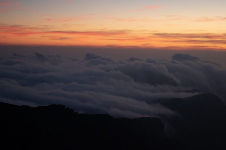

Again, these are just minimal edits but you can already see what differences they make. You don’t have much context in the first picture but in the second picture, you can see that the clouds are beautifully blanketing a mountain. Upping the clarity makes it clearer that there are various layers of clouds rather than just one big cloud. Upping the texture emphasizes the details in the mountain, which while still dark, adds a lot of context to the picture.
Dehaze is useful for emphasizing clouds in a picture where the sky is extremely bright. I don’t use vignette much but it is useful for focusing attention towards the center of a picture. Since this is a very introductory Lightroom lesson, I won’t go into much detail about those. You should be fine with just learning how to use clarity and texture effectively, or even just clarity.
Step 3: Vibrance, Saturation, Temperature and Tint
I don’t think anything affects the outcome of a picture more than this section of Lightroom. You can turn a picture into an intense, black and white shot or into a fun, vibrant, and colorful picture. Unfortunately, this is the part where I feel like most people make mistakes. Back then, I basically thought the more saturation the better. Boy was I way wrong.
Take a look below at Peru’s iconic Rainbow Mountain. The first pic is a recent edit and the second pic is how I edited it three years ago. The first picture is much closer to its natural colors and has minimal editing. The second picture, for some reason, I thought looked better at the time. Basically, I thought the more colorful, the better. Don’t make that mistake. Colors that are too strong or too bright might be off-putting to people.
My editing style has changed over the years and I prefer softer colors that aren’t harsh on the eyes.


Here is another example of how saturation and vibrance can change the identity of a picture.


Turns out, lowering the saturation and vibrance can actually make a picture look better! Chicago’s silver Bean looks much sleeker and much shinier in the second photo, and removing the dull colors gives the picture an overall shinier and cleaner look.
So when is it good to turn up the saturation and vibrance? Well, when the colors are the important part of a picture, then turning up the saturation and vibrance can turn a boring picture into a beautiful one. Below is a picture that will make you call me a fraud, but the fact is, a camera can only capture so much. Sunrises and sunsets are among the most beautiful things this world has to offer. But admittedly, trying to capture that beauty on a camera will usually fall short.


First, I turned up the exposure so that you can better see the foreground of the picture. Then I increased the clarity to strengthen the details of the picture. And finally, messed around with the vibrance and saturation. For a fiery sunset or sunrise like this one, I like to turn up the heat. Not literally, but I will up the temperature bar to warm up the picture a bit. To get a bit of that purplish-glow, I’ll increase the tint. Don’t overdo it, though, or you’ll end up with a very purple picture.
Finally, the vibrance and saturation. I like vibrance because it strengthens colors without making it look overdramatically colorful. Sometimes, I’ll turn up the vibrance and turn down the saturation. Mess around with what works for you.
Using the brush tool can also help you focus on what parts you want to make more colorful while leaving the other parts the way they are. The brush tool is especially useful for saturation as cranking up the saturation often results in some parts looking an odd, unrealistic color. For example, in that edit, the color of my flannel is a bit too neon blue for my taste. The brush tool can darken that and make it look much less edited.
Step 4: Throw On A Filter
At the very top of the editing module, you’ll see where it says Profile. Usually, its default setting will be on Color or Landscape or something like that. I usually don’t use a filter but I’ve found that applying a light filter can give your pictures a sense of cohesiveness when viewed together. With the importance of first impressions on Instagram, seeing a profile that flows beautifully with pictures that have a unifying vibe to it can be crucial.
For example, I’ll show you my normal travel blogger Instagram profile and then my photography profile.


On the left is @thepartyingtraveler, where I focus on travel stories and integrating myself into my pictures. I like each individual picture but don’t feel the need to have one unifying theme to my profile. Each picture has its own identity and is fine as a stand-alone photograph.
On the right, we have @chasingelsol, where I am not as focused on telling stories and integrating myself into my profile. I am full-on focused on taking beautiful pictures that mesh perfectly together. None of the pictures on the left have a strong filter, while the ones on the right have a filter to soften the colors a bit.
There are dozens and dozens of filters to choose from on Lightroom but my two favorites are Modern 08 and Vintage 06. They give an old-timey feel to the pictures and dull down the vibrant and colorful parts of the pictures.


Above is the same picture, one with the filter Modern 08 applied and the other without. Some would argue that the one without the filter looks better. It is a matter of preference. Like i said, I don’t always apply a filer to my photos but when I want to have a cohesive theme to my pictures, I tend to apply a filter that meshes the pictures together. There isn’t much difference looking at them side by side. But if you put them in a group of similar-looking photos like from @chasingelsol above, then the odd one out will stick out much more.
And there you have it. That’s pretty much how I edit my photos in Lightroom in four simple steps. It is all about experimenting and finding what works for you. Everyone has their own style of editing. I know you will find hundreds of other people out there with advanced Lightroom techniques but if you are a beginner like me, then this should suffice. You will get better with more practice and more time, especially as you get a better grasp on what each tool does and how you can use it effectively. I’m getting better and better at editing every day and you will, too.
I hope this free tutorial helped! If it did, give me the follow on Instagram! I’ve also since made my presets available for sale, including my Essentials Pack and my $8 South Asia-inspired starter pack!
Check out my other free guides below:
How To Start Your Own Travel Blog
I use it a lot, great tool !!
Oh wow those are some beautiful photos! I especially love seeing before/after when it comes to editing. I love using the lightroom app.
wow. your photos are STUNNING. thanks for sharing! I was so excited to find lightroom for free on the phone making it so much easier for instagram pics. i especially love the changes you showed for clarity!
Joy at The Joyous Living
GREAT advice on filters and editing… .loved your Feli account on IG too, am now following! xoxo Robin
I am amazed at the differnce the changes you made to the backpack photo created. It has a 3D look! I haven’t used Lightroom yet. I have it bookmarked and on my short list of must learn to do.
I love these Lightroom tutorials you have. They are so useful. I am learning so much! I would like to try the filters Modern 08 and Vintage 06 since you recommend so highly!
I love using Lightroom for photo editing. Really makes a difference enhancing the light and the colors to make it look vivid and stunning.
I would love to learn and start using lightroom. So amazing the difference your photos are incredible.
Looks great! I use Lightroom daily in my office job and for my blog/instagram – it is so much fun, once you know what you are doing 🙂
xx, Theresa
Wow, I learn so much from this post. I love photo shooting and glad to pick up some tips on photo editing.
Wow! This is really amazing! Thank you for sharing your ways in editing photos. This will be a lot of help for us.
oh i needed this!!!! Amazing tutorial! I thought editing photos is a lot more difficult than that, that is great. Thank you.
I only use lightroom, but am by no means an expert. I’ve bookmarked this article so I can refer back to it the next time I edit some photos!
Your photos are so beautiful. Lightroom is my go to for editing all my photos but if I want to do something pretty crazy I will go ahead and use photoshop.
This is some great information! I love taking pictures and editing them is definitely a process.
I know it takes a lot of time for you to become perfect in photo editing and these information will really help me to become one. Thanks for sharing this with us, really appreciate it.
This is a great introduction to Lightroom! Photos look way better when using this tool -Sondra Barker @cuisineandtravel.com
I’ve heard so much about Lightroom…it’s definitely a product I should invest in. Great tutorial and I love your photos.
Great article. This is a topic I know I need to learn more about and you really helped me understand some good ways to get started. Thank you
I use Lightroom also so this is very informative! I learned some things I did not know !!
I do use lightroom and love how it is able to get my photos looking fantastic for my blog. You have shared some great tips here, my favourite is tip 3 which is on vibrance, saturation, temperature and tint
I am still a newbie in editing my photos, and I always want to learn to use Lightroom. I don’t use presets, its an old trend already.
I love Lightroom for so many reasons! Really helps when editing a batch of stuff and you want to preset them all the same way.
Thanks for the intro to Lightroom. I’ve been using it for simple adjustments, although I’m mostly familiar with Photoshop. I need to dig into all that the program can do.
This is very useful to read. May I ask what a preset is?
These looks awesome. Thanks for your ideas